


Color Combinations – How to Stand Out in the Crowd
Click here to read the complete article
90 – November/December, 2016
by Erica Greathouse
This quote below from fashion icon Coco Chanel is especially helpful when choosing the best color to wear in the show pen. Constantly changing trends make the task of finding a complimentary color combo for both horse and rider seem daunting. Some consult the color wheel and adhere to fashion rules, while others throw caution to the wind and select cutting edge color combinations. We spoke with designers from some of the top show clothing companies in the industry to learn the criteria they use when selecting the best color combinations to make their customers look and feel their best.
“THE BEST COLOR IN THE WHOLE WORLD IS THE ONE THAT LOOKS GOOD ON YOU.”
– Coco Chanel
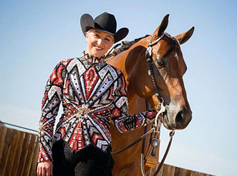
THE BERRY FIT COMPANY
With 30 years of experience in the horse show clothing business, Carolyn Berry of The Berry Fit Company, located in New Philadelphia, Ohio, has seen her share of trends come and go. Regardless of the current trend, Berry stresses that the harmonious blending of colors and lines should follow a few timeless guidelines. “Matching show clothing to a horse and rider is like decorating a room,” she says. “The body of the horse is the biggest color; that’s your background. In order to achieve the proper look, you need to think about choosing decorations that go with the rest of the room. In other words, all the other colors you pick are your accent colors that go with the rest of the room. Then, you need to style the room the way you like it.”
Choosing the proper look for a horse and rider is an intricate process that has taken many years to master. Berry notes that referencing the color wheel is a helpful way to decide which colors go best with which horse. However, there are other factors to consider when designing a winning look. “Generally, cool colors work on cool colored horses (black, bay, grey, white) and warmer colors work on warmer colored horses (sorrel, chestnut, buckskin, palomino). However, some horses don’t easily fit into one category or the other, so you have to have come up with other ideas and be flexible,” she says.
Berry also assesses the rider’s hair color and complexion. “I like to look at the rider’s skin tone and hair color. For example, if they have dark skin and dark eyes, going with black isn’t always the best idea, because they won’t stand out. Another tricky combination is a cool colored horse. For an example, consider a grey horse (cool) with a rider that has red hair (warm). In this example, you have cool and warm going on at the same time, so you have to find something that compliments both.” Another variable is the specific classes in which the rider competes as well as her age division. When Berry is speaking with a client, she tries to get a sense of who she is and what her personality is like, in order to pick a piece that will portray those qualities to the judges. Berry says, “Some people might look good in an outfit, but maybe that outfit doesn’t match their personality. The same thing goes with the amount of crystals on an outfit; some
people can pull off more bling than others. It’s important to remember that, while these outfits are over the top, clients still need to feel like themselves.”
90 – November/December, 2016